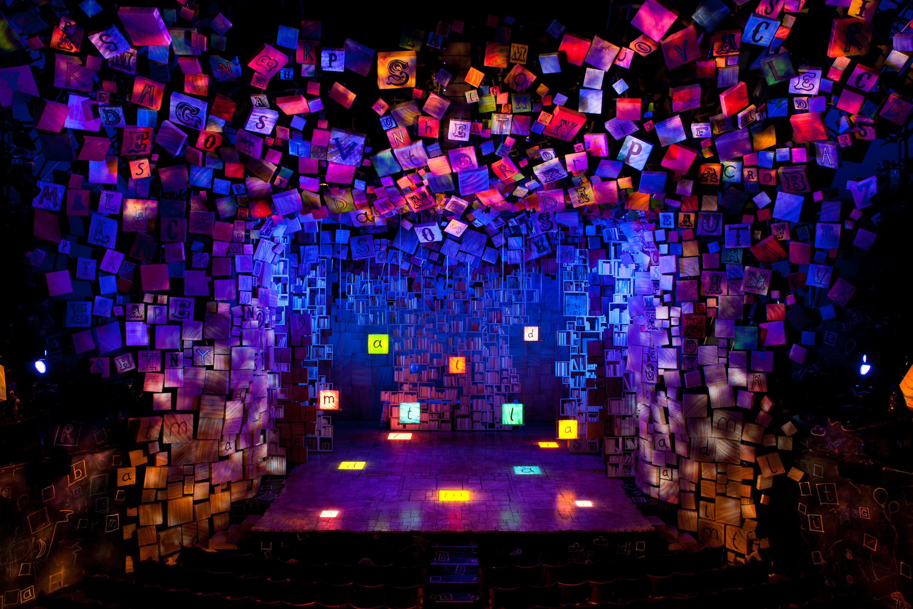
When set designer Rob Howell is asked whether or not he is good at Scrabble, he replies with a laugh. “I can be but only if it’s at the Shubert Theatre and I have 5,000 tiles to play with.”
Indeed, Howell played that “board” very well, winning a Tony Award for his wildly inventive and original sets for Matilda, the story of a intelligent young girl puzzling her way through a world of parental abuse and magisterial injustice.
Upon entering the Shubert Theatre, audiences are greeted with a jumble of wooden tiles of varying sizes and color, signaling the anarchy that is to come in the form of the loud and brash Wormwoods, Matilda’s zany family, and the pathological craziness of her nemesis, Miss Agatha Trunchbull, the headmistress of Crunchem Hall. While there is a certain ominous threat in the air, Howell immediately cuts through it even before the show begins. The set designer has puckishly hidden various words in the tiles that spill out from the proscenium arch, including his favorite: B-U-R-P. It’s a high-scoring one with the children in the audience.

“It was rather hidden in the West End,” says Howell of the Royal Shakespeare production, which transferred from their home in Stratford to the West End before bowing on Broadway. “I made the word burp easier to find on Broadway. I just take pleasure in kids pointing it out and saying it loudly.”
This playful spirit is of a piece with Howell’s whole conception of the design of Matilda, under the tutelage of director Matthew Warchus and inspired by his other collaborators, including writer Dennis Kelly, composer Tim Minchin, choreographer Peter Darling and lighting designer Hugh Vanstone. The “messiness” immediately apparent in the set was key to the entire creative endeavor. “Children’s playbooks are invariable messy and they should be,” says Howell. “There’s something terrifying in accuracy and perfection. If you achieve it, it’s dull. There’s no place to go. So every time any form of accuracy raised its ugly head, we’d quash it. If you can keep the messiness in the air, it creates a sense of hope and journey.”
The designer says that at first he was stymied when first tasked with providing the touchstones of Matilda’s journey. He spent years going down the wrong path in attempting to construct that world out of desks and blackboards. “When I added color to them, they lost their potency as objects,” he said. In growing frustration, he chanced upon the brilliant idea of alphabet tiles which not only had the warmth of familiarity but also retained their power when tinted with color and sized proportionately. The crucial three-dimensional depth was in no small measure enhanced by Vanstone’s lighting.
“It was very liberating, everything opened up, ” says Howell of his “eureka” moment with the tiles. “Now I knew how to break up the world physically. I knew how to build walls and doors, how to work [the set] like a puzzle that anybody could do.” Furthermore, he adds, Roald Dahl, who wrote the novel on which the musical is based, “was constantly scratching away at the common ground that adults and children share. And in a literal way, if I have a Scrabble tile in my hand and it’s the letter ‘A,’ it has the same possibilities for me as an adult as it has as a six-year-old child.”
While that parity might have been inherent in the tools that eventually accrue at Matilda’s disposal in her battle against injustice, the imbalance of power between adults and children is keenly felt through an exaggerated sense of scale and a very specific placement of the tiles. A child standing next to a large tile underlines the fact they are existing in a world of menace that is too big for them. So too with the contrast between Matilda quietly sitting on a small pile of books in the Wormwood’s living room while the rest of the surroundings clash with vulgar and ridiculous accoutrements. Says Howell “So that when Matilda and the children choose to fight back it is all the more surprising. It’s a bigger, more emotional story.”
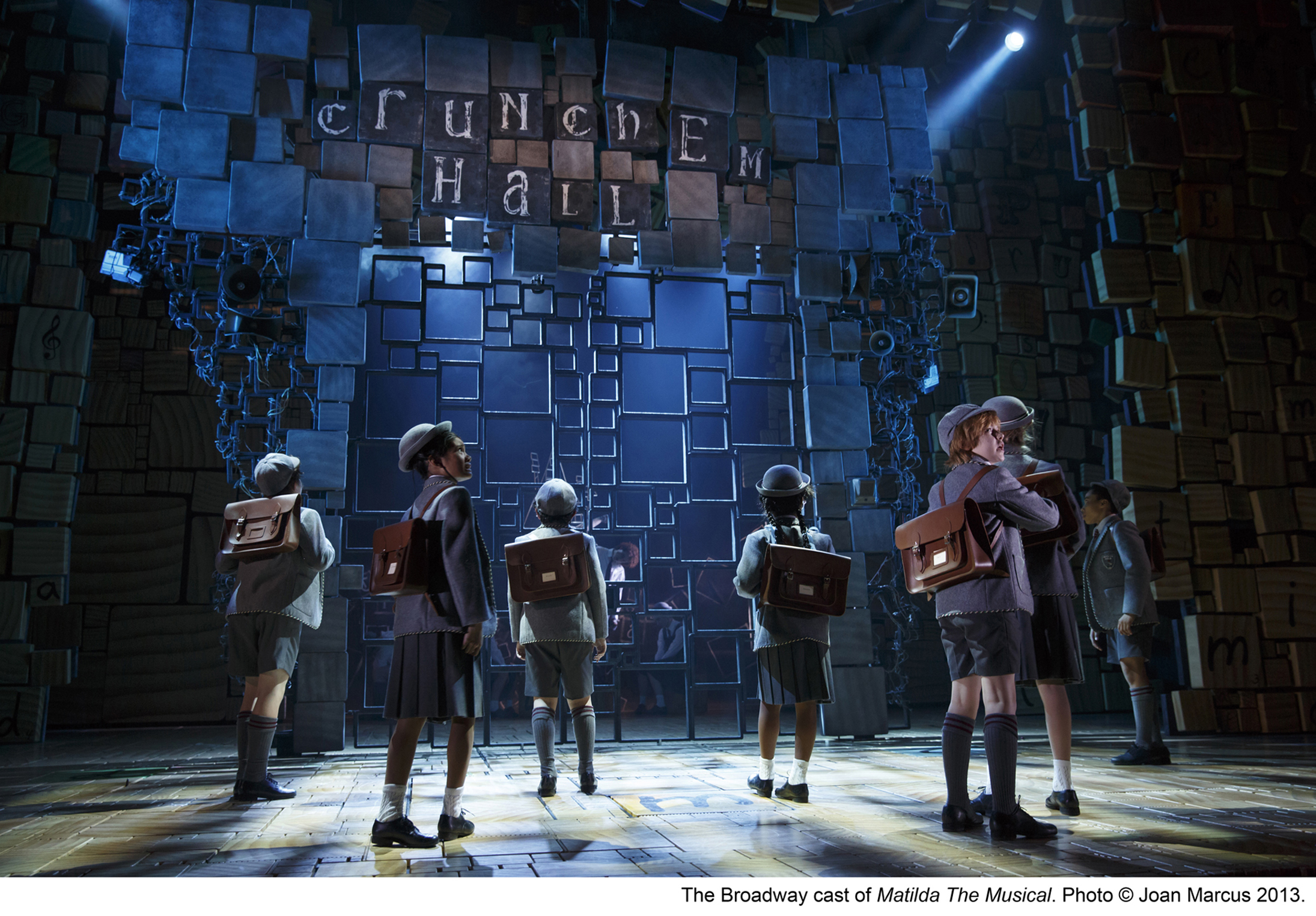
As someone who went to a number of schools, most notably in Surrey, England, Howell says that he was personally familiar with the fear that children feel as they approach the gates of a school, not knowing what is on the other side of them. When Darling, the choreographer, saw Howell’s design for the gates of Crunchem Hall, he suggested that the alphabet blocks might be useful to scale those gates. “We both understood well the language of approaching a door with a certain trepidation,” says Howell, “especially when what’s waiting for you is someone like Agatha Trunchbull.”

Designing the lair for this gorgon was fun for the set designer. Since Trunchbull had once been a hammer-throwing Olympic champ, he knew that gleaming trophies would take up some shelves in her office but that alone would not give anybody a clue of who the character might be outside of her sports prowess. So he built a “hodge-podge of craziness for a demonic control freak”: banks of chaotically wired closed-circuit TVs and crazy bizarre gadgets resembling a starship for a Big Brother. “You can imagine Trunchbull following the activities of every corridor and classroom from there,” he says. “You can imagine her at night somewhere with a hammer and nail banging stuff together to stop disorder from taking flight.”
The relief from the menace of Crunchem Hall for both Matilda and the audience comes in the form of Howell’s simple designs for the home of Miss Honey, the teacher who comes to her rescue, and the library where Matilda’s finds solace in books and in the sympathy of the librarian, Mrs. Phelps. Originally designed for the thrust stage of the RSC’s Stratford theatre, Miss Honey’s home could have no walls instead settling for an impressionistic design that conveyed a warm haven from the chaos. When the production transferred to the proscenium stages of the West End and Broadway, Howell eschewed the opportunity for a re-design. “We stumbled upon it for technical reasons but it seemed right for the simple laidback esthetic for Miss Honey,” he says. Likewise for the library. The designer says that he wanted it to be a refuge of “spiritual calm and tranquility” for Matilda. Given the frenetic and brassy world of the Wormwoods, “it was like being out in Times Square and coming into a chapel,” says Howell.
Since Howell designed the costumes for Matilda as well as the sets, he delighted in having the opportunity to carry on the trashy taste of the Wormwoods in their dress and hair as well as their house. “You’ve got complete license to go as far as you dare,” he says with a laugh. “The hair can be higher, the green plaid can be brighter, the dresses tight and florid. These are the sort of Dahl-ian creations that invite you to take your imagination as far as you can.”
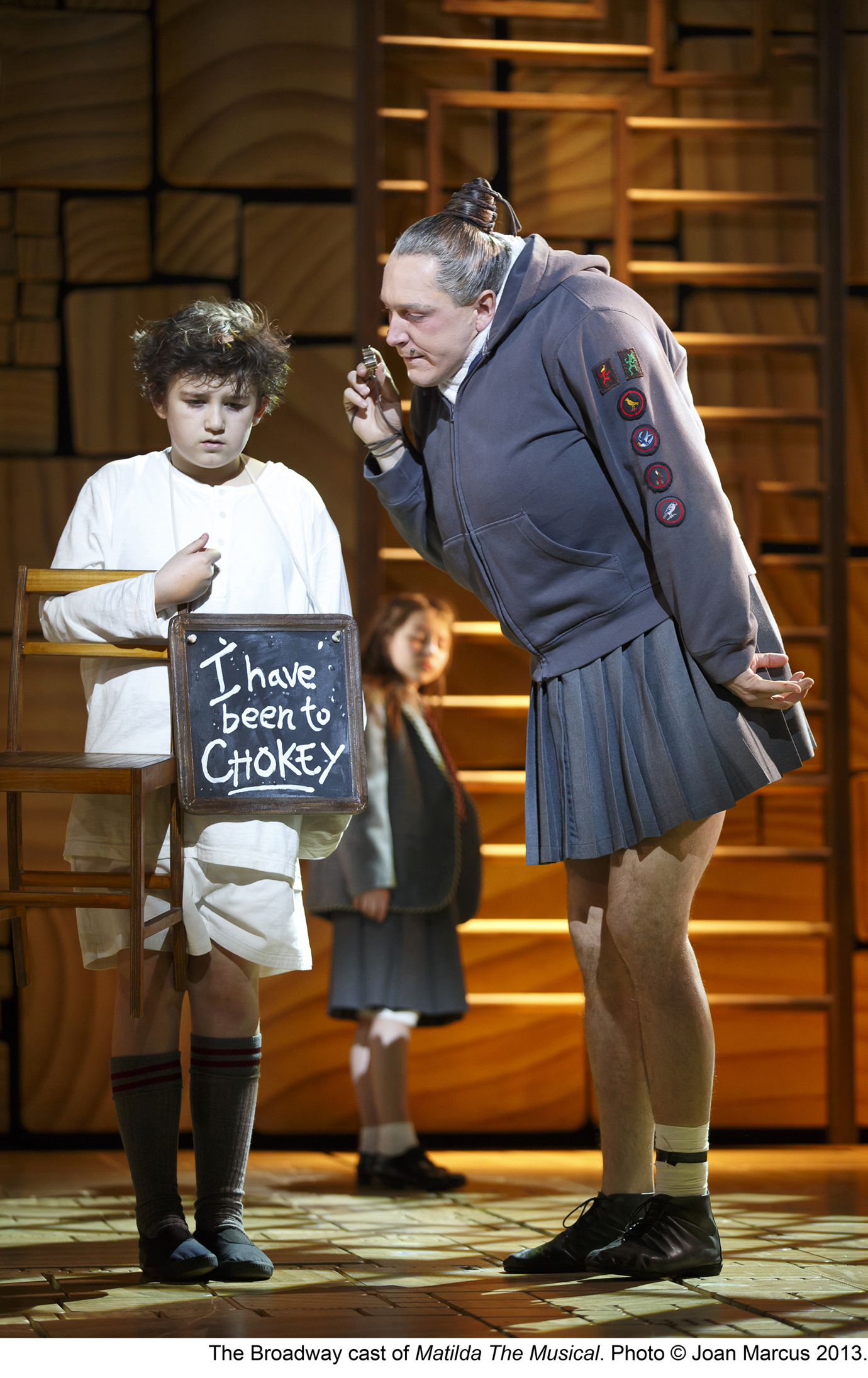
 That outre invitation extended, of course, to Trunchbull whose outrageous totalitarian outfit of brown coat and britches was taken in part from the original illustrations that accompanied Dahl’s novel. The costume, in fact, was based on a real one worn by a close friend of the writer’s, a certain horticulturalist who went by the name of Beatrix Havergal. Trunchbull’s other costume, one which invariably elicits howls of delight from the audience, is what the designer describes as her “gym kit.” In a hilarious scene, Miss Agatha doffs her gym jacket to reveal two large misshapen breasts jutting from what appears to be a sports bra combined with a weightlifting unitard. Howell said that he left it intentionally ambiguous. “It would be a shame not to recognize it as something we might have seen before and yet not be able to exactly place it,” says Howell. Indeed, that seemed true of all of his designs for the show: familiarity mixed with a totally original iconoclasm.
There was, however, one part of Trunchbull’s gym costume which was entirely familiar and daintily feminine. “I couldn’t resist giving her a pleated skirt, “ says Howell. “Who could?”
Photos by Joan Marcus.


